Back in 2011, touch devices were fairly new but catching up quickly in the education space.
While I was with LearningMate, an ed-tech company, I prepared this document for the in-house designers to understand the fundamentals of touch screen tech and some basic guidelines document to design touch based UIs.
Table of Contents
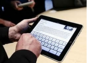
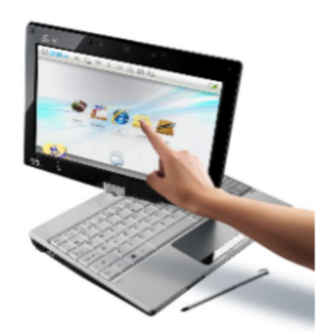
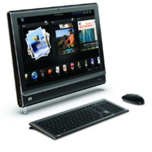
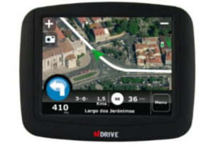
Touch devices available circa 2011
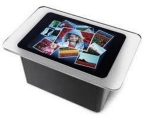
Touch Technologies
Commercially touch screens were mainly available in 2 types.
- Resistive, uses a pressure sensitive technology registering the pressure applied to the screen using a finger or any other tool.
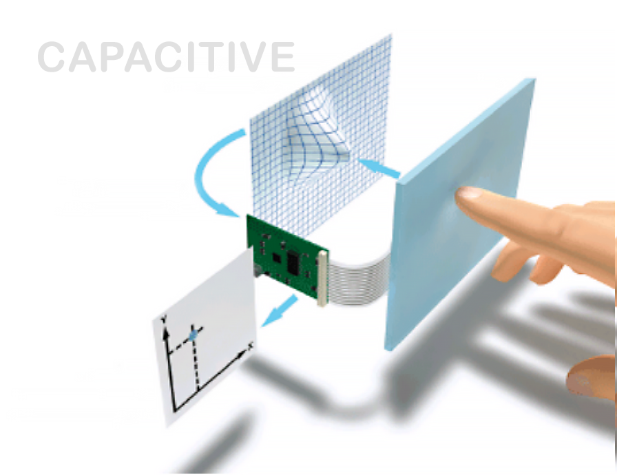
- Capacitive, uses a tiny static charge generated by the human body to register a touch action.
Resistive
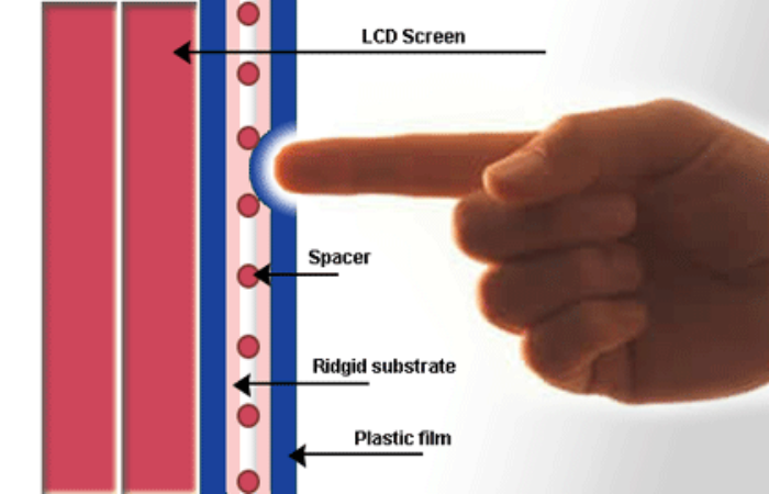
Advantages
- Cost effective and durable
- Input can be made using a stylus or finger.
Disadvantages
- While using fingers, slightly more pressure needs to be put on the screen
- Provides only 75% optical transparency which means that its clarity is lower than capacitive touch screen
Capacitive
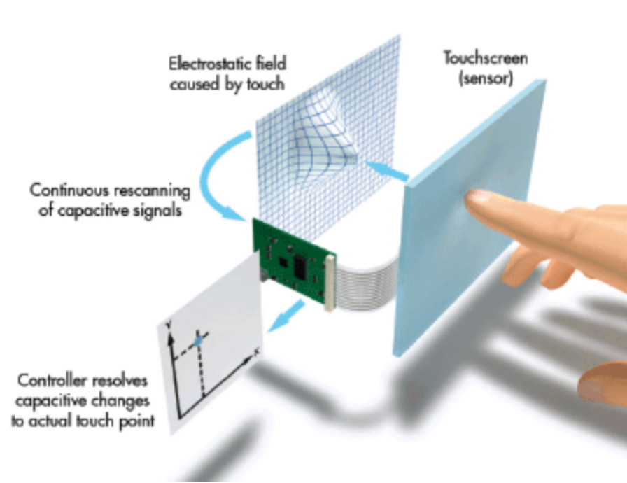
Advantages
- Higher clarity display (up to 90% optical transparency)
- Supports multi-touch
- High touch resolution
- High sensitivity
Disadvantages
- Needs a human finger to register input.
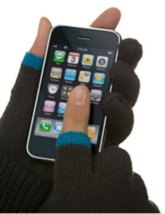
- It is not possible to use this screen wearing gloves
Problems with touch based interaction
Touch sensor
The quality of the touch sensor determines how accurate the touch response will be. In this video, you can see how all touch screens are not made equal.
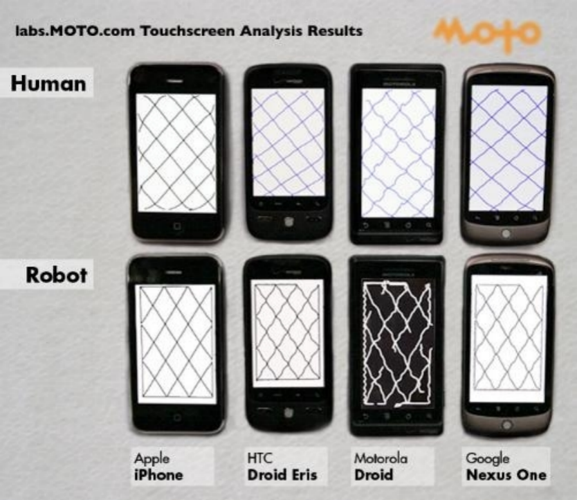
Elements towards the edge of the screen are difficult to hit.
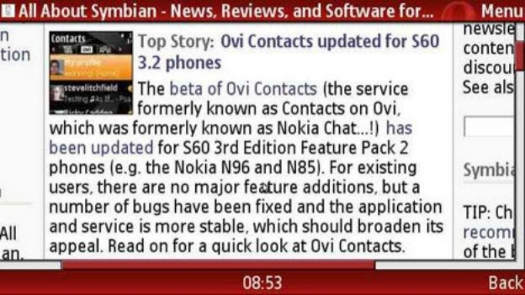
A standard in the web/desktop design is to put elements in the corners. For eg: Windows Start button, the Close button on a window, the file menu, to name a few. With the sensor issues seen above combined with the small screen sizes the corners are the most error-prone spots on mobile device. Example of a Nokia touch screen phone browser makes for bad user experience.
Parallax
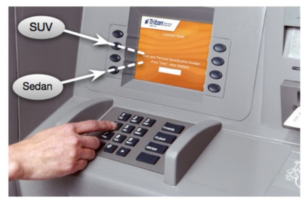
Depending on the thickness of the screen, you should expect some level of the Parallax effect. This problem is very commonly seen at the ATM machines where users viewing angle is different from the action angle of the finger and you end up touching the wrong mark on the screen.
No hover (a typical mouse pointer action)
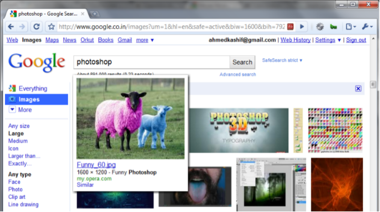
While designing UIs for Web or Desktop we are often depend on Mouse-over or Hover actions to show contextual information or reveals additional actions. This nifty technique is not available on touch screen devices.
Frustrations
- Because of the above conditions, when the user erroneously hits the wrong target, the result of a touch error is severe.
- Typing needs more concentration. More demanding in the physical context than mechanical keys.
- Tapping a touch screen button while wearing winter gloves, or with long fingernails can be difficult.
Guidelines and Best Practices for touch
Remember Pixel Density
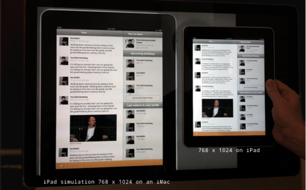
Web body text sizes (14–16px) feel too small on iPad. Choose a higher font size.
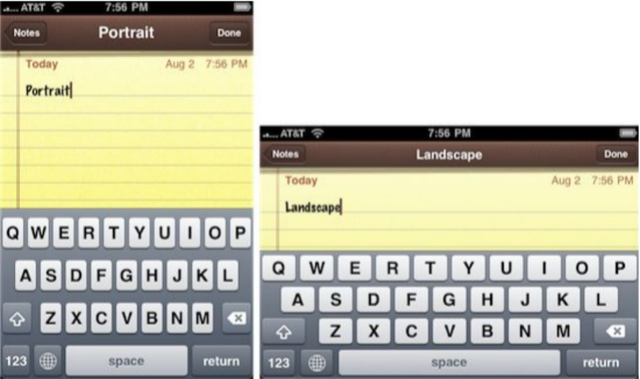
Screen Orientation Changes
Make it work seamlessly in landscape and portrait mode. Avoid Multi-touch operation that require posture shift or grip change.
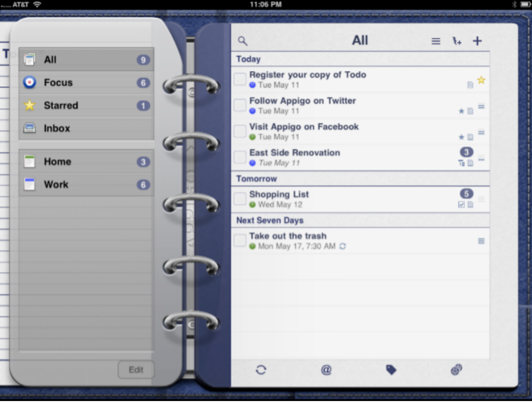
Everyday interfaces
Everyday interfaces are easy to understand and familiar in their use. Apple Guidelines recommend designers to imitate tangible things.
(Apple will later move away from skeuomorphic design styles.)
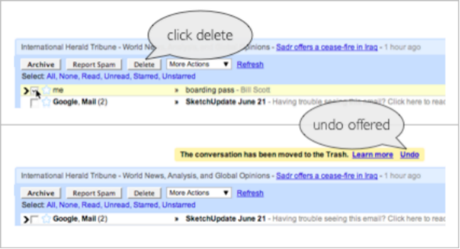
Provide 'Undo'
Provide the option to ‘undo’ an action whenever possible
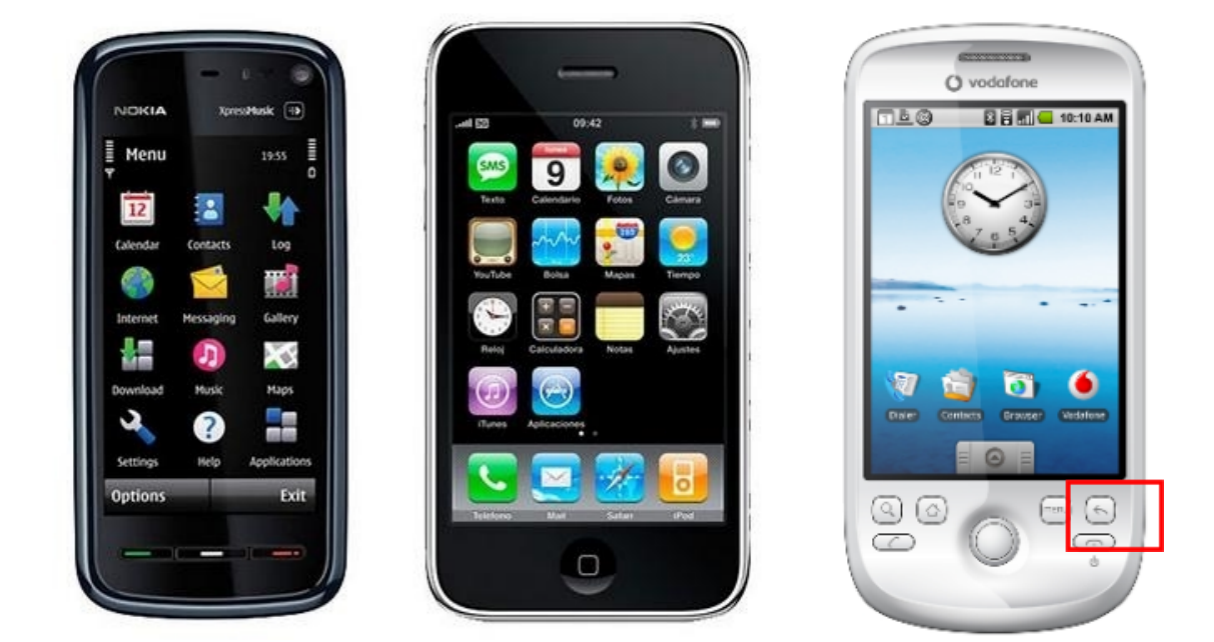
Aim for a flatter navigation
Aim for flatter or shallow navigation. Not all devices have a dedicated ‘Back’ button.
Remember Fitt's Law
Larger hit area, to fit the finger taps and to possibly show content underneath.
To sum up…
- Remember Pixel Density
- Screen Orientation Changes
- Everyday interfaces
- Provide ‘Undo’
- Aim for a flatter navigation
- Remember Fitt’s Law


