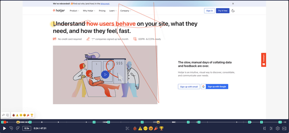
As part of user research conducting user behaviour reviews is key step. I use an app called HotJar that records user interactions on a website and provides a list of recordings that can be played back like a video. It also creates heat maps based on page scrolls and mouse movements.
Why do we conduct user behaviour reviews?
This is a qualitative study and lets us witness users behaviour on the website. It is a passive, uninterrupted observation of users’ actions and helps us make sense of the gaps between users’ expectations and their actual experience on the website.
This is quite a time consuming task. Each recording lasts anywhere from 30 secs to 20 mins or more. And depending on the website traffic, there can be thousands of recordings. It’s neither feasible nor required to watch all the recordings. Use different filters to narrow down as much as possible. Typically, viewing between 25 – 50 recordings, we can see both negative and positive recurring patterns.
Narrowing it down!
A relevance score uses various data points to estimate a recording’s usefulness. A score 3 and above are good starting point. Sorting by relevance brings the important recordings to the top of the list.
Setting the date range is an easy way to reduce the number of videos while keeping it relevant. Keep in mind dates for any new feature releases, sales events, or any other activity that may affect behaviour.
Most of the 30sec to 1 min videos are bounce offs. Better to get them out of the way. Go with the average time on site metric on Google Analytics and set this filter accordingly.
Filter for page names to keep your study focused. If you are trying to understand the behaviour during checkout, include the ‘Confirmation’ page in the filter. Similarly, the filter for My account pages will show recordings where the users are dealing with account related issues. Combine filters like Landing Page, Visited page and Exit Page to isolate full journeys.
As a matter of practice I always include the filters used in our reports.
| Filters applied to Hotjar recordings: Sort: most recent Date range: 09/11/20 – 01/12/20 Visited: any pages / checkout Pages: 3+ Duration: 3m+ Country: All Device: All (desktop, mobile and tablet) |
How to select the right videos to watch?
Despite setting the filters you could still end up with hundreds, if not thousands of videos. How do you pick the right one?
- Longer videos usually provide more context
- Use the Hotjar columns like relevance, frustration, engagement metres to determine the more important ones.
- Looking at the pages and actions count gives an idea how busy the user has been on the site.
- Making sure you have the right balance between devices based on a usage split. If 60% of the users are on mobile, your observations should also be based in a similar ratio.
What do you look for?
At first pass, look at a recording to know what the user is doing. Then replay it or jump to key moments where you see the user making a choice based on the experience on the website. If the user is not able to make a choice then you see the frustration, these are captured in the form of rage clicks.
Confidence
You’ll see a lot of users having trouble understanding the layout or design. As a merchant, it can be a humbling experience to watch users fail at what you think are easy, workable designs.
Confusion
You can spot confusions when users are doing multiple top-bottom-top scrolls or few back and forth on the pages. It can either be a navigation issue or the user doesn’t see expected information or is looking for an expected CTA.
Mistakes
It’s common to see users make a lot of mistakes. As a stakeholder, you use your website very often but keep in mind that the user is doing so for the first time. They may come with their own expectations on how your site should work.
Bugs
This is an obvious one. Sometimes you can see issues with functionality or design. You may also notice some users trying to find a workaround which may not be possible. Shows you how many people are actually motivated to finish tasks on your site.
How it all comes together
Make note of all the important actions the user has performed. From this point you have to speculate what the user was intending to do. Then look at our other sources of discovery to corroborate the speculation with rationale. Finally, make notes for improvements then incorporate into the final designs.


