Windows UI
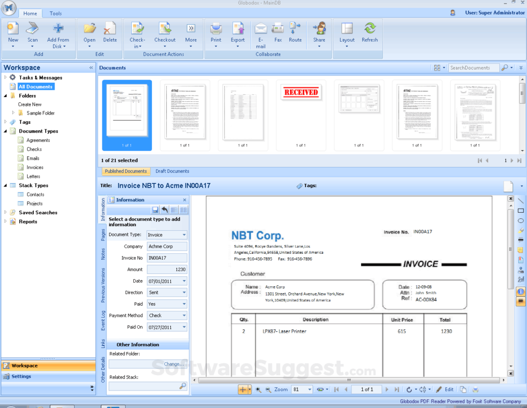
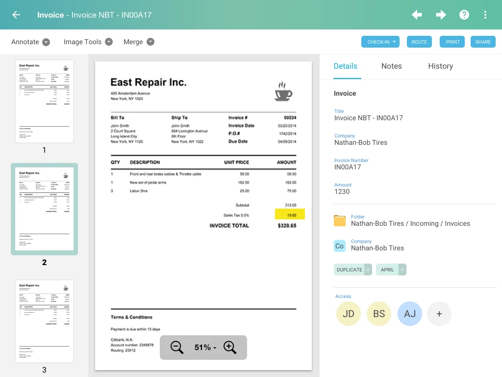
Globodox, a Windows based document management software wanted to create a web based interface.
Seen here is preview of a single document view (SI View) embedded in the main UI. Organic growth had led to a lot of UI elements being cramped in toolbars running on all sides.
Goal was to simplify the UI that will be easy to understand and develop on the web. This was also taken as an opportunity to improve on the existing design.
Simplified Web friendly UI design
New web based UI accommodates all the 17 action UI elements in a simplified web friendly layout. Scroll for details.
How were the elements moved?
Seen below are 17 elements that were relocated in the Web UI to be contextually closer. UI appears to be simplified and easy to grasp and action.
Numbers badges specify locations for UI elements in existing Windows view on top and new locations in the Web view.


