TupeloLife Digital Therapeutics is Remote Patient Monitoring (RPM) and Virtual Care Management company that has been in the connected health space since 2012. Their goal is to help patients live healthy and independently from the comfort of their own home.
Scope
Tupelolife care management application shows data from three devices – the blood pressure monitor, glucometer and the heart rate monitor. Based on the prototype built by the dev team, the scope was to research and design the tablet app.
Objective
-
- Research focused around the users who are elderly and face physical challenges in their daily lives.
-
- To identify these challenges
-
- Create a set of guiding principles. These guidelines will then help with the design decisions I take during the design process.
Target Audience
Personas help us define a typical user from within the Target Audience
-
- Target audience consists mainly of males and females over the age of 55.
-
- Audience may be living in a care centre/home or may require regular trips to a clinic for checkups.
-
- A major portion of the audience will have one or more type of reduced ability. For e.g.: hearing loss, vision problems, etc.
Research
To identify key problems faced by the target audience.
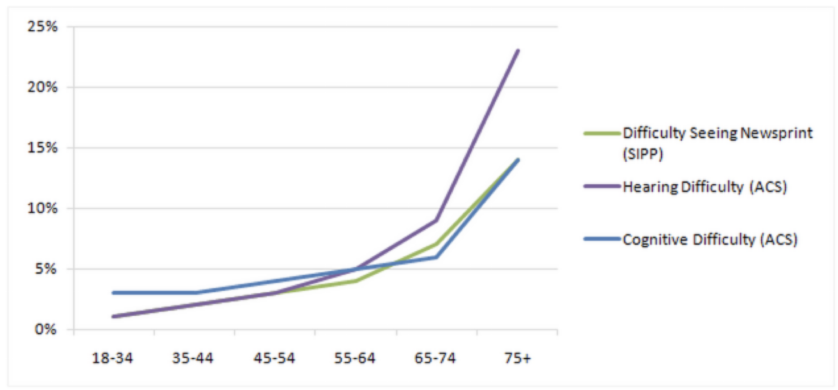
Visual and Hearing difficulty shoot up at the 65 years age mark
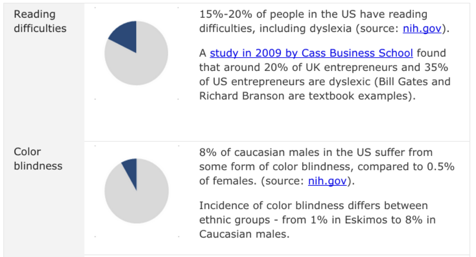
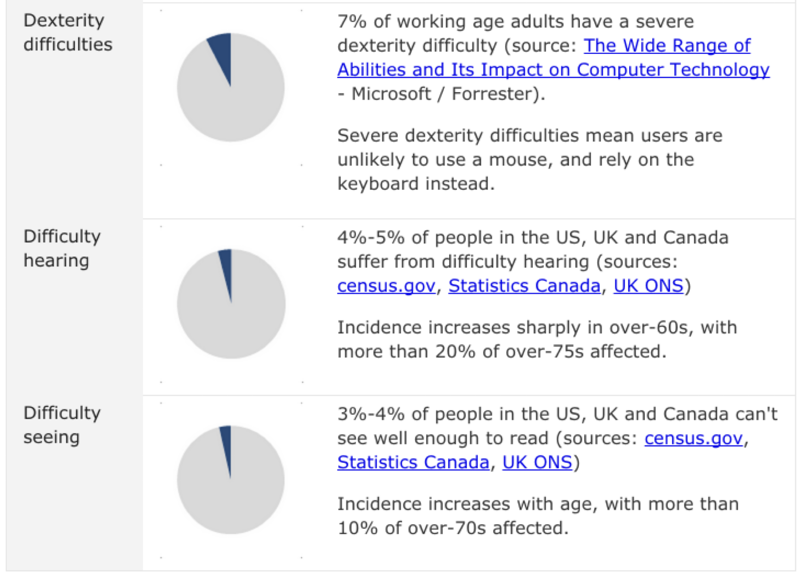
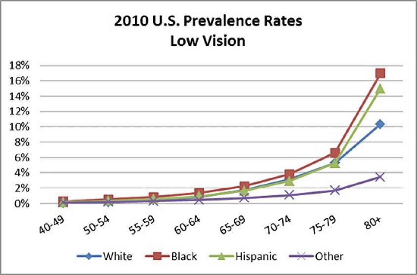
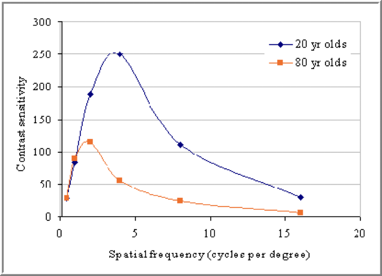
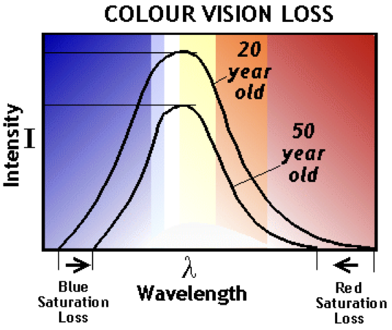

Access Systems for People with Disabilities
Generally speaking, people with disabilities require assistive or adaptive devices to assist them in rendering or viewing a document. Those in the disability technology field refer to these as “access systems.” For example:
-
- The blind may require a document output of braille or synthetic voice
-
- Those with low vision or dyslexia may need large text or spatial adjustments
-
- Individuals who are deaf or the hearing impaired may require visual cues for electronic documents that include sound or audio events
Test your pages for color contrasts
Samu Mielonen recommends that you test your pages by adjusting your monitor to 256 shades of gray and then look for the following:
-
- Can you distinguish the different colors on the basis of their lightness values?
-
- Are you using too many different colors (lightness values) that just confuse the reader without adding information to your design?
-
- Check for blue/yellow and red/green combinations. If you use these color pairs to distinguish information, you’re in trouble with dichromatism
Source: Designing the Web for People with Disabilities – By Mike Paciello
Analysis
Chances of seniors suffering from the following conditions increases after the age of 50Based on the research and the analysis, the following UX guidelines are prepared for the app

UX Guidelines
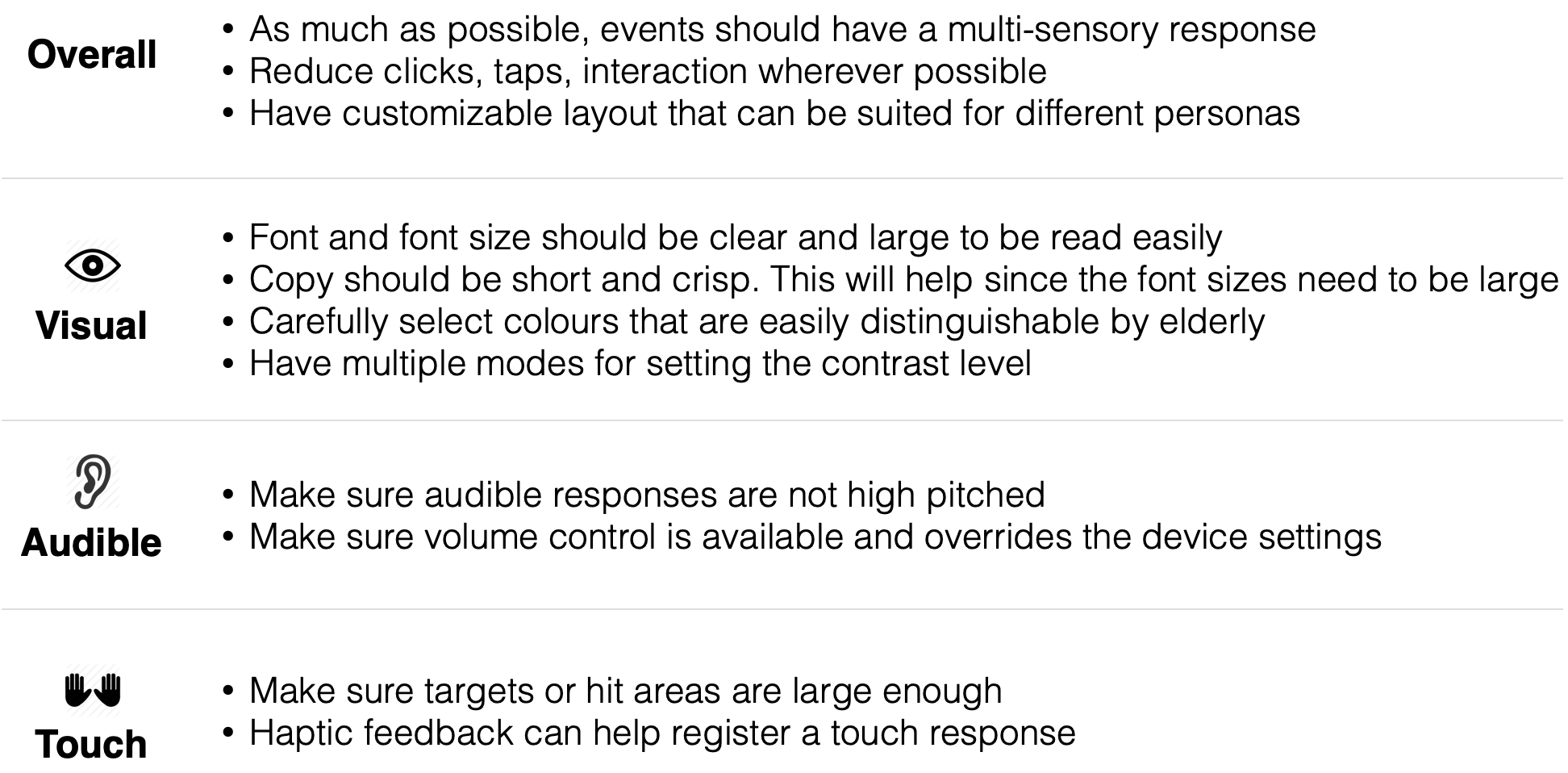
Based on the research and the analysis, the following UX guidelines are prepared for the app
Based on the research information and the capturing details from the prototype as well as client meetings, the following structure was developed.
Information Structure
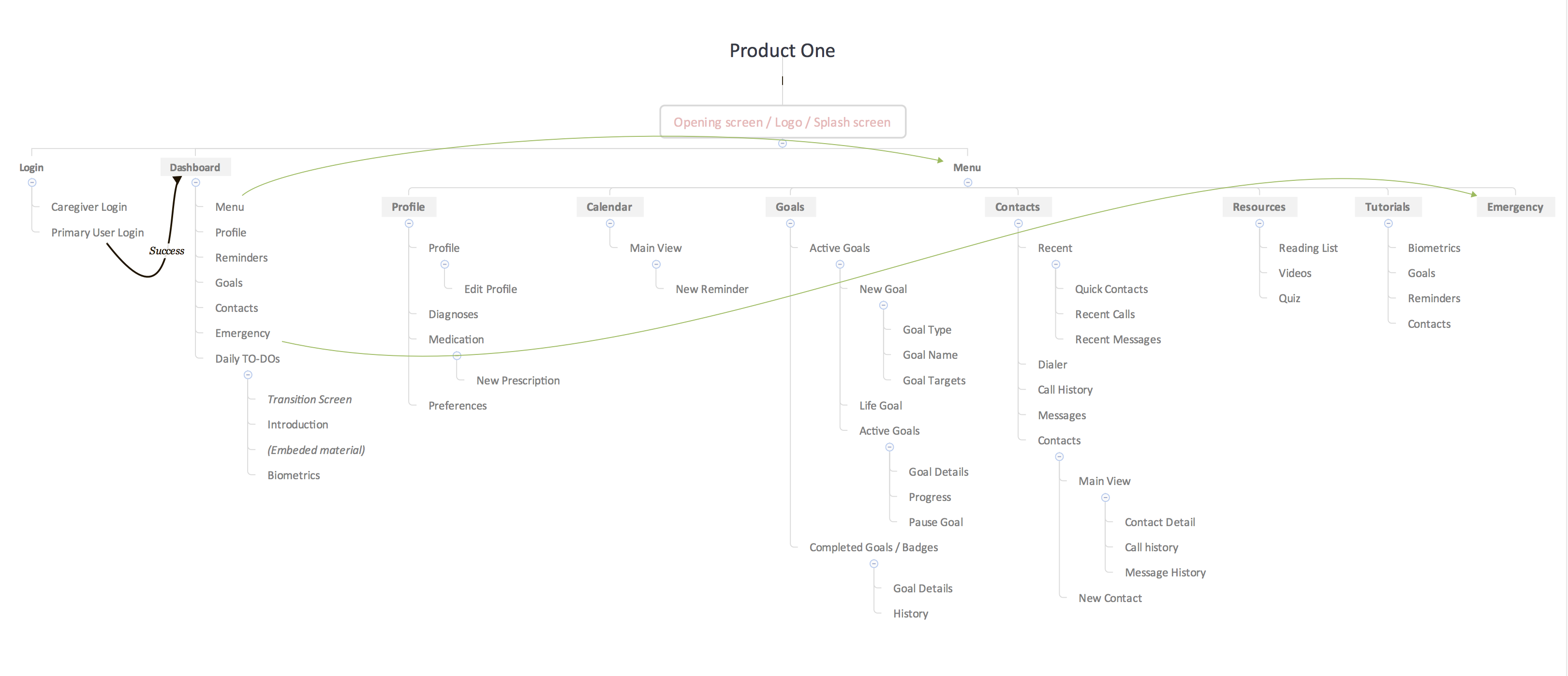
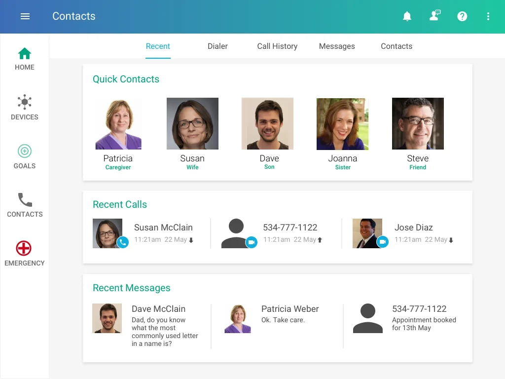
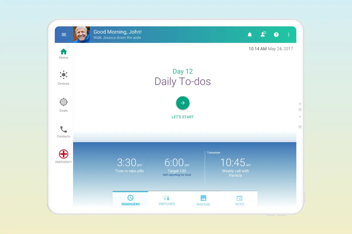
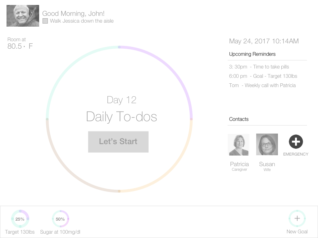
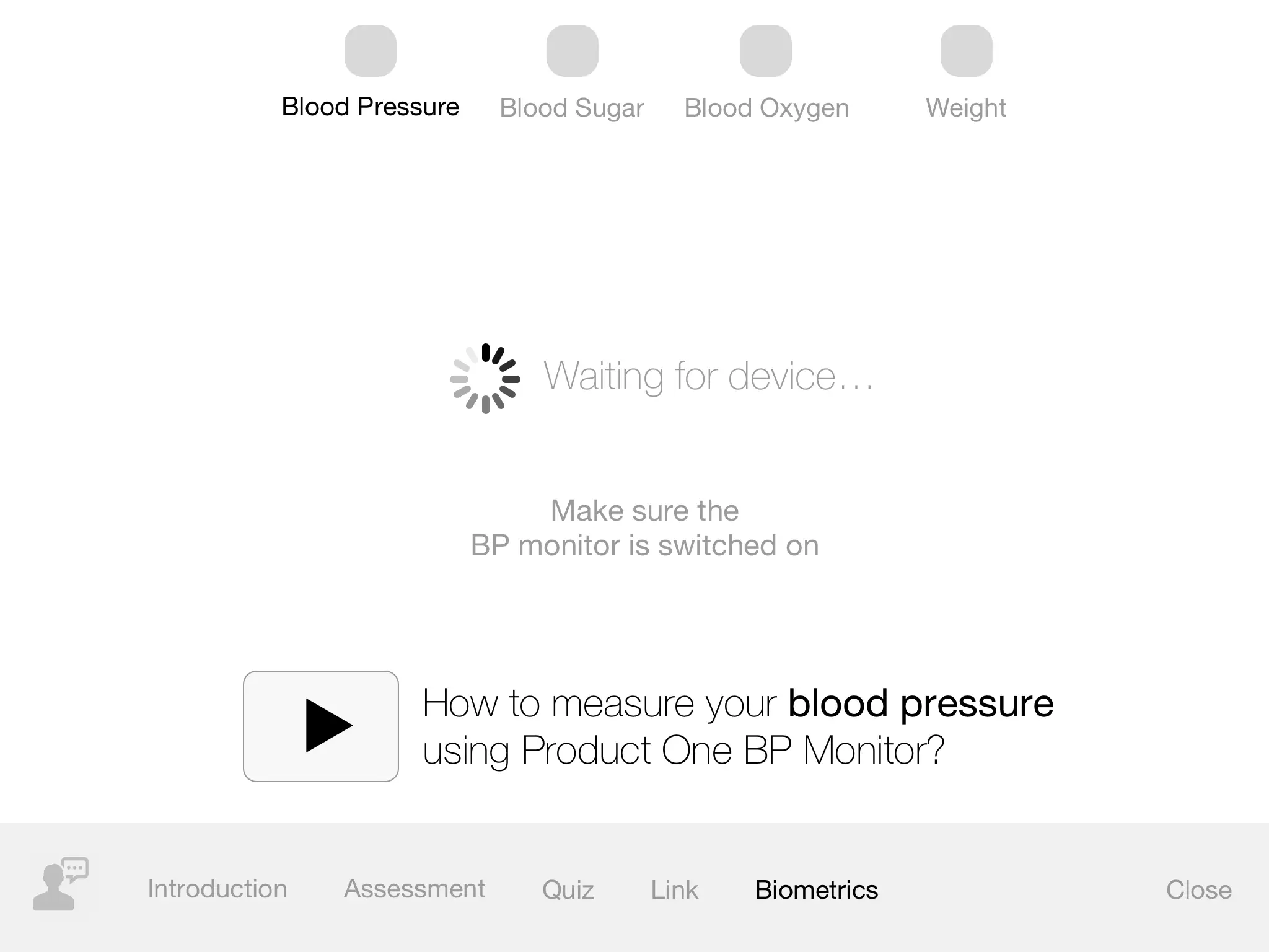
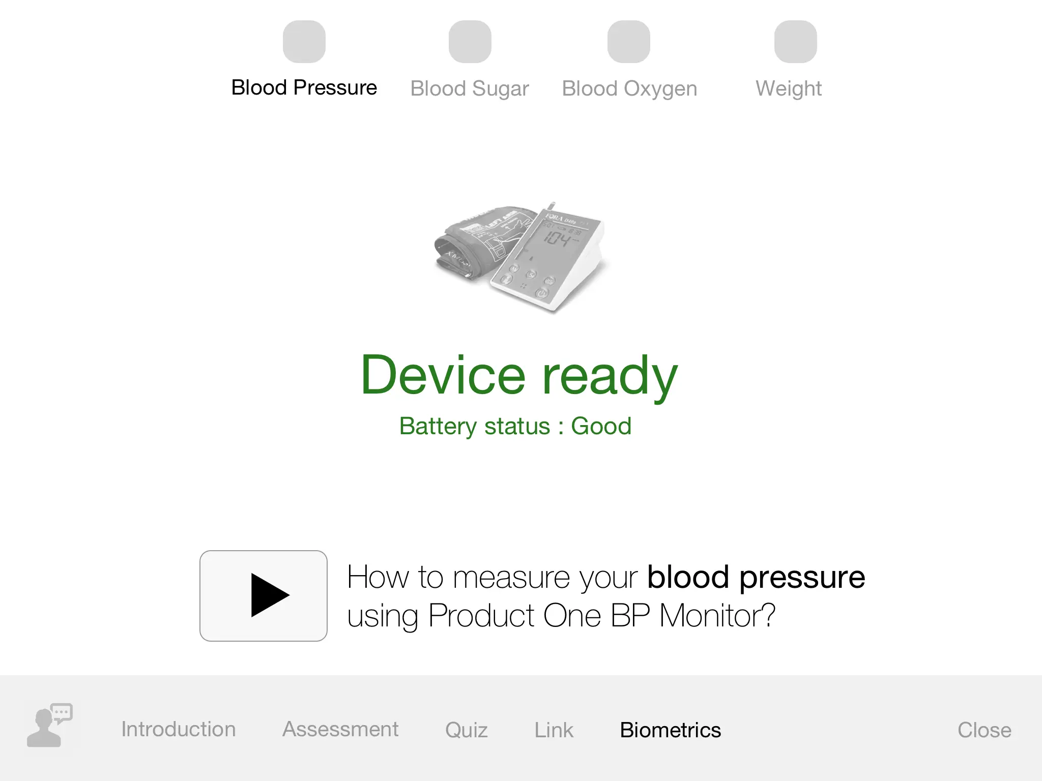
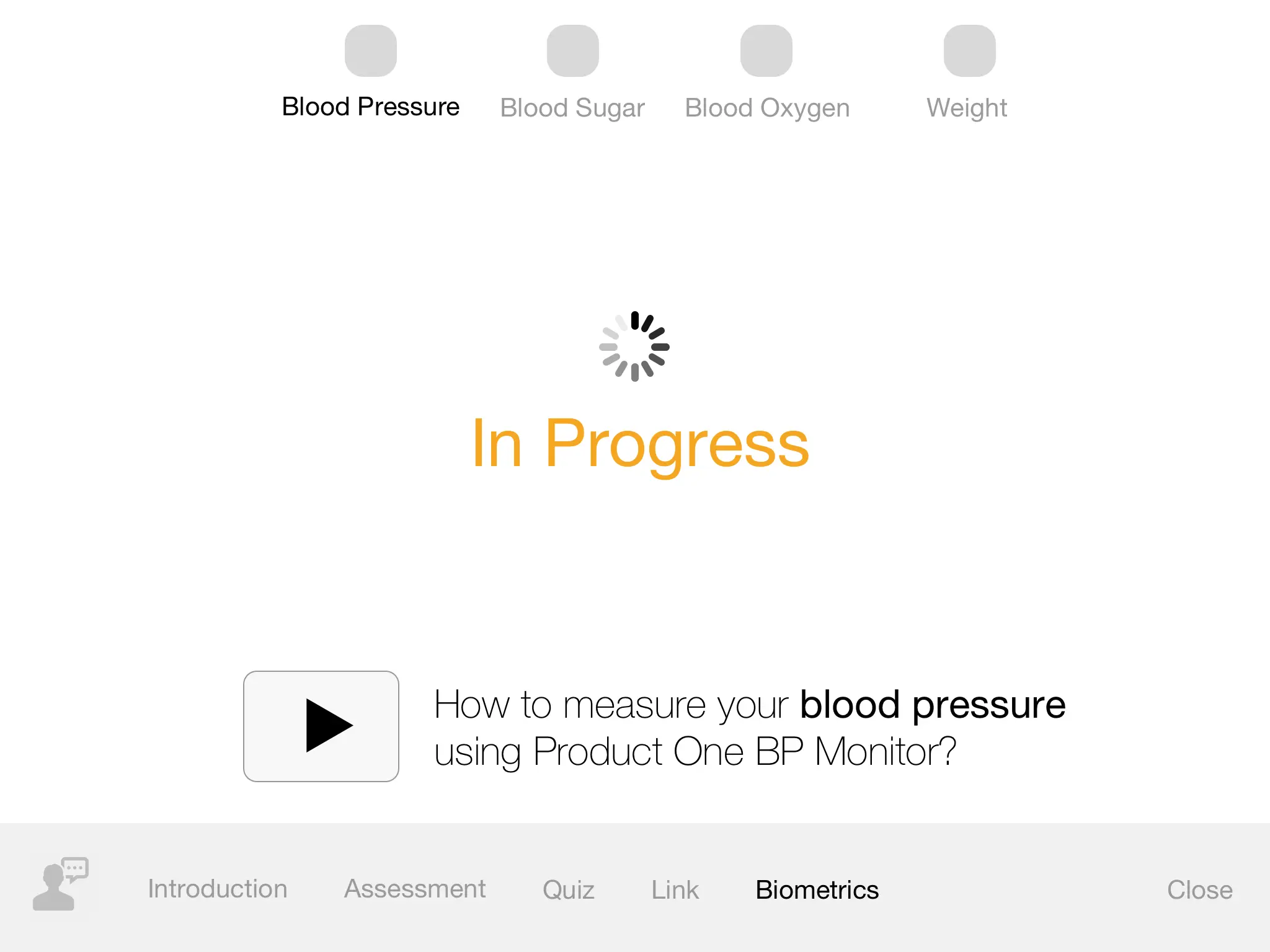
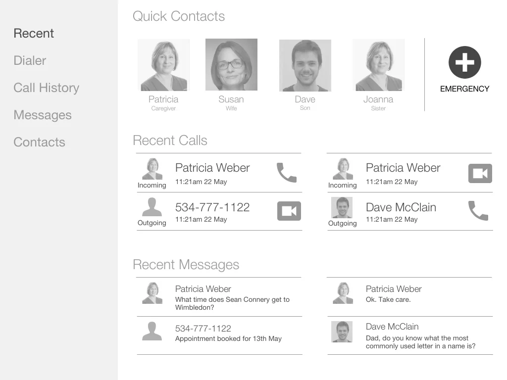
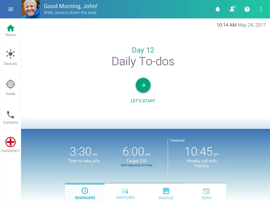
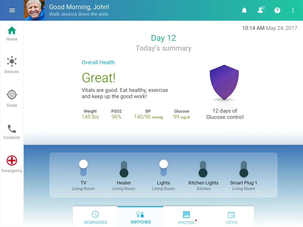
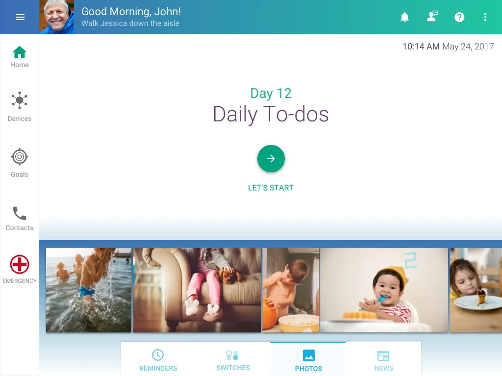
While the prototype was designed only to capture the vitals 2 to 3 times a day, the app’s focus was make this experience easy to use. To achieve this we focused on making the app appear more friendly by design and added the convenience of a Reminder feature to beep and remind patients when it was time to record their vitals. The app scope was later extended to include contacts in case of emergencies. For patients to quickly get familiar with the app, the ability to controls devices like lights, TV, heating, etc. and see family photos and get news was also introduced.
Wireframes
Dashboard
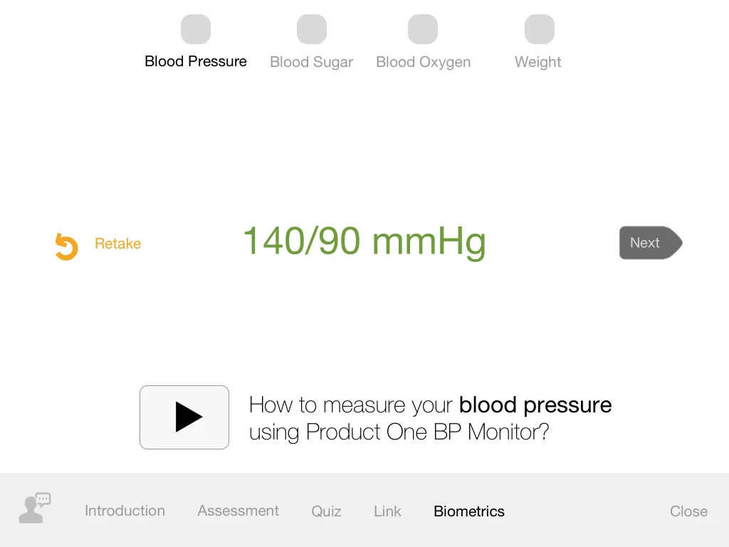
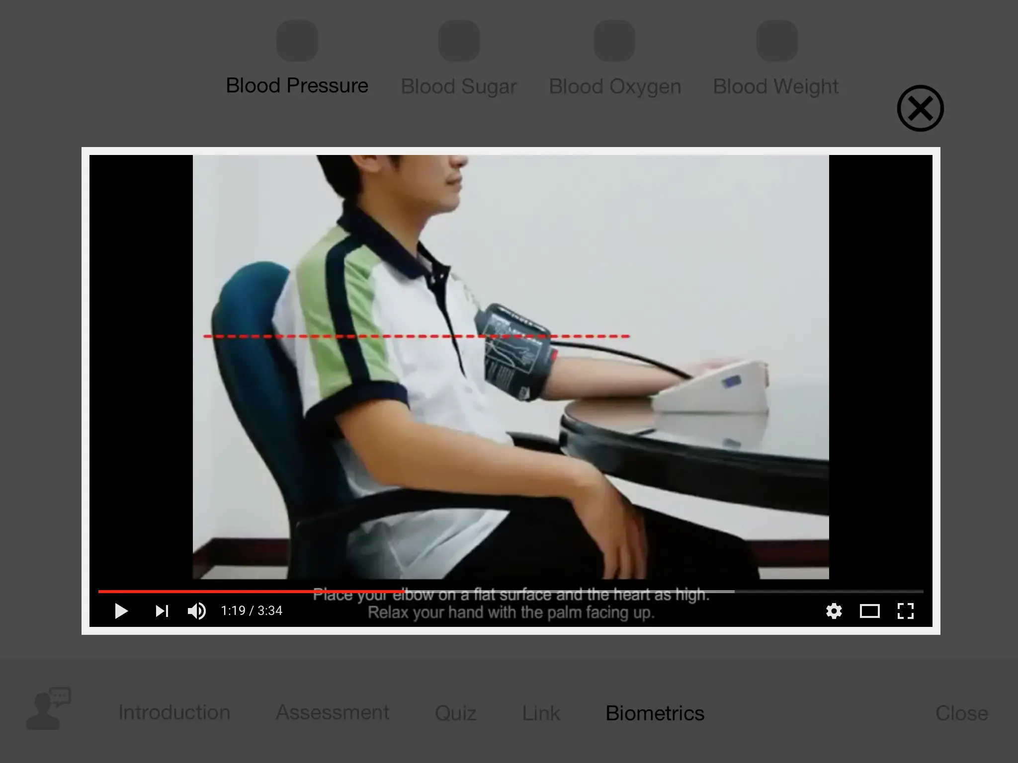
Measuring Blood Pressure
Contacts
Visual Design
Dashboard – Reminders (Default)
Dashboard – Switches
Dashboard – Photos
Contacts
